
Email Wrappers
Email Wrappers are the templates that wrap your email content, providing consistent branding across all your emails. Every email sent through Solidarity Tech uses a wrapper to define the header, footer, colors, fonts, and overall design.
Creating an Email Wrapper
Navigate to Settings → Email Wrappers and click Create Wrapper.
You'll be presented with two options:
| Option | Best For |
|---|---|
| Visual Builder (Recommended) | Most users. Create beautiful, responsive emails without writing code. |
| HTML Editor | Advanced users who need complete control over the HTML/CSS. |
Visual Builder
The Visual Builder creates professional, mobile-responsive email templates—no coding required.
Getting Started
Upload your logo when creating a new wrapper. The system will automatically:
- Extract your brand colors to create a cohesive 5-color palette
- Detect whether your image works best as a logo or full-width banner
- Select optimal background colors for header, content, and footer
- Set up a complete, professionally designed template
If you don't upload an image, the builder uses your organization's website theme (if available) or a clean default palette.
The Builder Interface
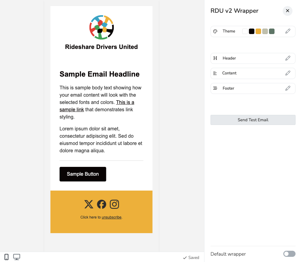
Header
Configure how your email header appears.
Image Settings
| Setting | Description |
|---|---|
| Image Type | Logo – Constrained size, centered or with name beside it. Banner – Full-width image spanning the entire header. |
| Image Source | Use your organization's default logo, or upload a custom image for this wrapper. |
| Logo Size | Adjust the height of your logo (40–150px). Only applies to Logo type. |
When to use Banner: Use a banner when your image already contains your organization name or branding text built-in. Use a logo when you have a square icon or symbol.
Organization Name
| Setting | Description |
|---|---|
| Show Organization Name | Display your organization's name in the header. |
| Name Position | Below – Name appears centered below the logo. Right – Name appears beside the logo (modern, horizontal layout). |
| Custom Name | Override the organization name with custom text. |
| Show Tagline | Add a secondary line of text below the name. |
Social Icons in Header
Optionally display social media icons in your header. These link to URLs configured in Settings → Chapter Structures.
Content
Control how the email body area appears.
| Setting | Description |
|---|---|
| Content Style | Full Bleed – Content fills the entire width. Inset – Content appears in a card with an outer background color. |
| Background Color | The color behind your email content (typically white for readability). |
| Outer Background | For Inset style only—the color that appears around the content card. |
| Spacing | Compact, Normal, or Spacious padding around content. |
| Button Style | Rounded – Subtle rounded corners. Square – Sharp corners. Pill – Fully rounded ends. |
Footer
The footer contains essential information and can be fully customized. Drag and drop sections to reorder them.
Available Footer Sections
| Section | Description |
|---|---|
| Footer Image | An optional branding image. |
| Description | Custom text—great for taglines or mission statements. |
| Featured Button | A call-to-action button with your URL. |
| Social Icons | Links to your social media profiles. |
| Organization Info | Your mailing address (required for CAN-SPAM compliance). |
| Unsubscribe | Required unsubscribe link. Customize the text and use `` as a placeholder for where the link appears. |
| Paid For By | Political disclaimer with a visible border (optional). |
Adding Dividers
Click + Add Divider to insert visual separators between sections. Choose from:
- Line – Solid horizontal rule
- Dashed – Dashed line
- Dots – Three centered dots (• • •)
You can add multiple dividers and reorder them like any other section.
Footer Spacing
Choose Compact, Normal, or Spacious to control the padding and gap between footer elements.
Theme & Colors
Click the Theme section in the sidebar to customize your color palette and typography.
Color Palette
Your wrapper uses a 5-color palette. When you upload a logo, colors are extracted automatically. You can also click any color swatch to customize it manually.
Each section (Header, Content, Footer) can use any color from your palette as its background. The system automatically calculates proper text, link, and button colors for contrast and accessibility.
Typography
| Setting | Description |
|---|---|
| Primary Font | Google Fonts for modern email clients (Apple Mail, iOS Mail). Options include Open Sans, Roboto, Montserrat, Playfair Display, and more. |
| Fallback Font | Email-safe fonts for clients that don't support web fonts (Gmail, Outlook). Options include Arial, Helvetica, Georgia, Verdana. |
Social Media Icons
Social icons appear in your footer (and optionally header) and link to URLs configured in Settings → Chapter Structures for your organization.
Supported platforms: X (Twitter), Facebook, Instagram, YouTube, TikTok, Bluesky, Threads
Icon styles:
- Plain – Simple icons that match your theme colors
- Outline – Icons with circular outlines
- Filled – Icons with solid circular backgrounds
HTML Editor
For complete control, create a wrapper using custom HTML/CSS.
Required Template Tags
Every HTML wrapper must include these Liquid tags:
| Tag | Purpose |
|---|---|
{{ content }} | Where the email body content is inserted |
{{ unsubscribe_url }} | The dynamic unsubscribe URL (use inside an <a> tag) |
{{ preview_text }} | Hidden preview text shown in inbox listings (optional) |
Example Structure
<!DOCTYPE html>
<html>
<head>
  <title>{{ organization.name }}</title>
</head>
<body>
  <!-- Your header HTML -->

  {{ content }}

  <!-- Your footer HTML -->
  <a href="{{ unsubscribe_url }}">Unsubscribe</a>
</body>
</html>
Tips for HTML Wrappers
- Use tables for layout—email clients don't support flexbox or CSS grid
- Inline your CSS—many email clients strip
<style>tags - Test in multiple email clients (Gmail, Outlook, Apple Mail)
- Copy the default "General Wrapper" as a starting point
Scope & Default Wrappers
Wrappers respect Solidarity Tech's scope system:
| Scope | Access |
|---|---|
| Root Organization | Available to all chapters |
| Chapter | Only available to that chapter |
Toggle "Default wrapper" at the bottom of the builder to make it the default for new emails in that scope.
Restrict to This Scope Only
In the wrapper's settings, you can enable "Restrict to This Scope Only". When enabled, the wrapper will only be available to users at that scope or a parent scope. Users at child scopes (like chapters under an organization) will not see this wrapper in their dropdown menus when composing emails or configuring automations.
This is useful when a parent organization has wrappers that should not be used by chapters, for example a wrapper designated for organization-wide communications only.
Guaranteed availability: Unlike email domain restrictions, the system ensures that every scope always has access to at least one email wrapper. If restricting a wrapper would leave a child scope with zero available wrappers, the system will still provide that scope with one fallback wrapper (preferring the default wrapper, or the earliest created wrapper if no default exists). This prevents a situation where a user cannot send emails because all wrappers have been restricted away from their scope.
Mailing Address
Your mailing address appears in email footers for CAN-SPAM compliance. Update it in:
Settings → Chapter Structures → Select your organization → Mailing Address
Testing Your Wrapper
Click Send Test Email in the builder to see exactly how your wrapper renders in real email clients. Always test on both desktop and mobile.
FAQ
Q: Should I use Visual Builder or HTML Editor?
A: Use Visual Builder unless you have specific HTML requirements. It creates mobile-responsive emails that work across all clients.
Q: Can I switch from HTML Editor to Visual Builder?
A: No, the type is set at creation. Create a new wrapper with Visual Builder instead.
Q: Why don't my social icons appear?
A: Social URLs must be configured in Settings → Chapter Structures for your organization.
Q: Can different chapters have different wrappers?
A: Yes. Log into the chapter scope and create a wrapper there. It will only be available to that chapter.
Q: What happens if a recipient's email client doesn't support Google Fonts?
A: The fallback font you selected (like Arial or Georgia) is used automatically.
Q: How do I change the unsubscribe link text?
A: In the Footer section, edit the Unsubscribe content. Use {{link}} where you want the clickable link to appear. For example: "Click to unsubscribe from our emails."
Updated about 2 months ago