
Graphs
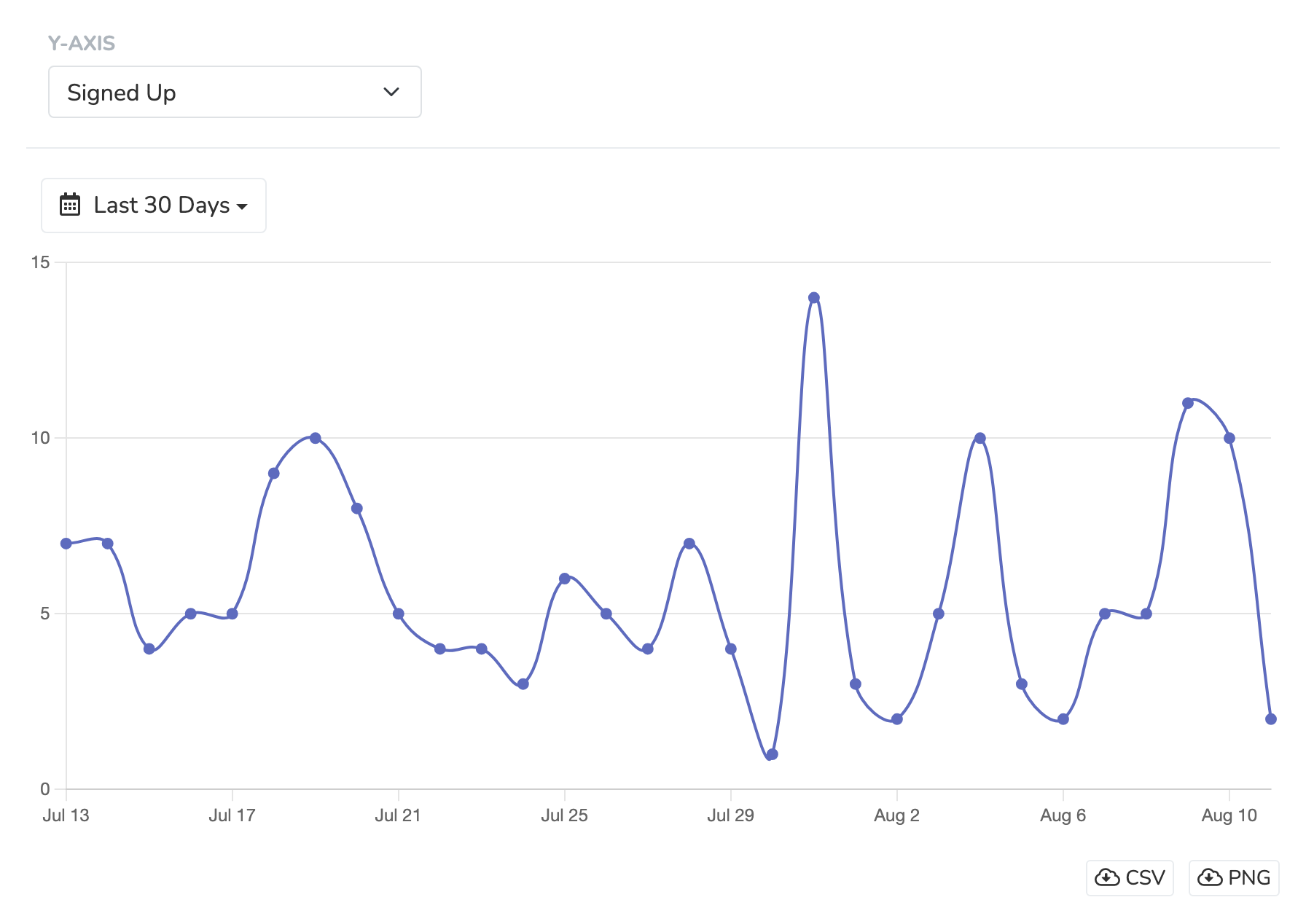
The Graphs section of the "Reporting" tab helps you visualize your data in graph form in a variety of useful ways. You can select from the list of pre-set Y-axes data metrics and set the date range for which you'd like to analyze the data. You'll immediately see a plotted line graph, with a table view of the data underneath.
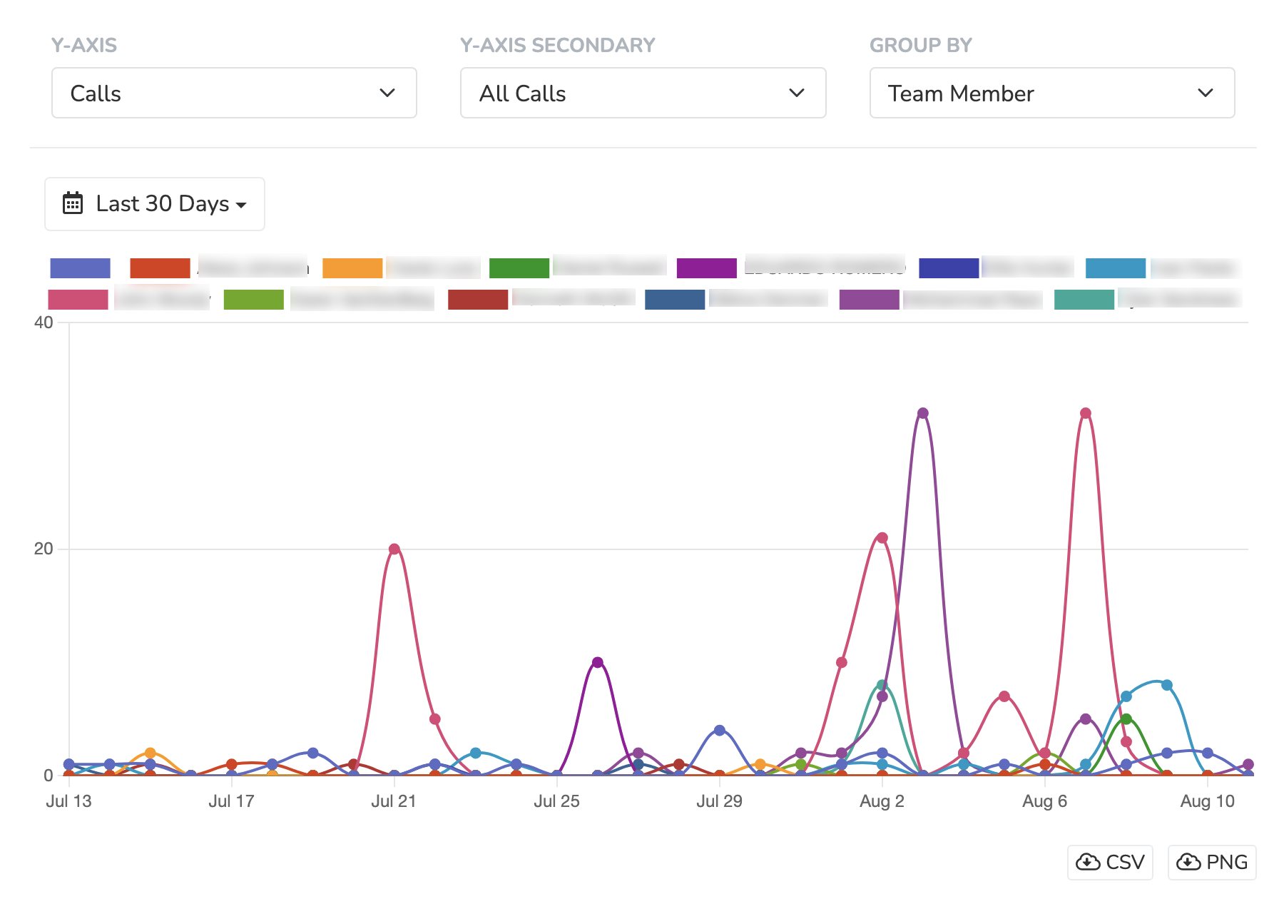
Certain y-axis fields let you choose a secondary y-axis and a "group by" field in order to add another dimension to your graph visualizations. For example, the "calls" y-axis field has a secondary axis for call status (eg. all calls > 2 minutes, etc.) and the ability to group by Team Member making the call:
For any graph produced, you have the ability to fully export the data either in CSV format or as a PNG.
Updated 5 months ago