
Forms
Visitors to your Page can submit Forms from your Website. If a Person with the specified phone number or email already exists in your contact list, their existing record will be updated. If no Person exists, a new Person record will be created upon a successful Form submission. User Fields (email, phone number, name, language, zip code, country) and Custom User Properties will update the associated fields on the Person record with the latest data from a Form submission.
Forms are used across all Page Types - events, petitions, donations, and more.
Set a Default Form Template: Tired of adding the same fields to every new page? Go to Pages → Your Website → Settings tab and select a Default Form. Any page you select will be used as the template for all new pages you create - its form fields, settings, and layout will be copied automatically.
Custom Form Fields vs. Custom User Properties: The "Add New Form Field" dropdown has two separate sections that look similar but behave very differently:
- Custom User Properties (listed by name, e.g. "Yard Sign Request", "Volunteer Role"): These fields write directly to the Person's profile on submit. The field's Name / ID and options are locked automatically. Use these when you want to track data on each person.
- Custom Form Fields (generic types: "Text", "Dropdown", "Checkboxes", etc.): These fields store data only on the form submission, not on the Person's profile. Use "Query by Form Question" in filters to find responses. Use these for one-off questions that don't need to live on the person's record.
If you want form answers to appear on a person's profile and be filterable as a custom property, always add the field from the Custom User Properties section. See Custom Properties for details.
Recognized users
A visitor to a Page on your Website will either be recognized as an existing Person in your database, or an unknown visitor. Ideally, all visitors to your Page who already have an existing Person record in your database will be recognized, so that we both tailor the page to them (language content, more focused form fields), and avoid duplicate People records.
There are two ways a user can be recognized:
- Once a Person submits a form, a cookie is stored on their device so that they will be recognized on any further pages they visit on that device.
- From any email or text communication, using Page Links with a merge tag will generate a personalized link for that Person so that they can be recognized once they click on the link to arrive at your Page.
When a user is recognized on most form Pages (Event Petition, Donate, Share your Story, or Group Montage, Call/Email Legislators), they will have the option to logout via a link on the sidebar if they are not the person they were recognized as.
Using Forms on a Shared Device
When hosting an in-person event, tabling session, or fundraiser where multiple people submit a form on the same device (e.g., a shared iPad), the default cookie-based login behavior will attribute all submissions to the first person who submitted. To prevent this, enable "Don't Recognize Logged-In User" in the page's Settings tab. This prevents pre-filling and treats every submission as a new person. The "Not [name]? Click here" link is also disabled.
Alternatively, append ?logout=true to the page URL to sign out the current user before each submission.
For team members collecting info on behalf of others: Use Field Survey mode (Form tab > "Show as Field Survey") instead. This is designed for agents filling out forms on behalf of people via the mobile app.
Form requirements
All Pages with forms require an email or phone number field to be able to add new People who submit the form to your People database. Depending on the page type, your form may require additional fields (eg. share your story requires a video upload).
Show options
When determining whether to show or require a particular form field, there are 5 options that you can choose:
Always Required: A Person can not submit the form unless this form field has been filled out.
Required if Blank: This form field is required unless we have a recognized user logged in, who already has a valid value attached to their record for this form field.
Always Visible: This form field will always be visible, but will not be required to submit the form.
Visible if Blank: This form field will be visible and not required, unless we have a recognized user who already has a value for this field, in which case it will be hidden.
Visible conditionally: Allows a form field to be visible depending on certain conditions. You can show a field dependent upon whether another specified field a) is valid, b) is equal to a specified value, or c) contains a set of values.
All Form Field types
To add a new form field to your Page, navigate to the Form tab and use the "Form Fields" section on the left panel. The Form Preview section allows you to preview the form either logged in (with a recognized user) or logged out:
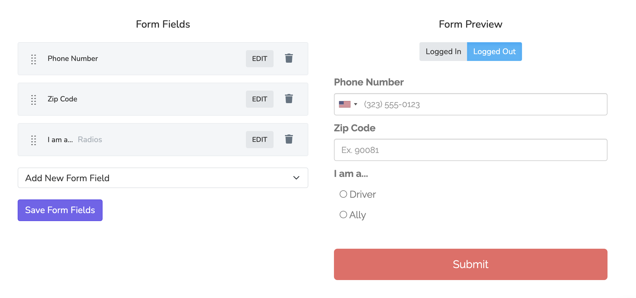
Here you will see all Form Fields on the left, and a preview of the actual form on the right. You will have to save the Form Field in order for the Form Preview to refresh. To add a new Form Feld, use the "Add New Form Field" dropdown:
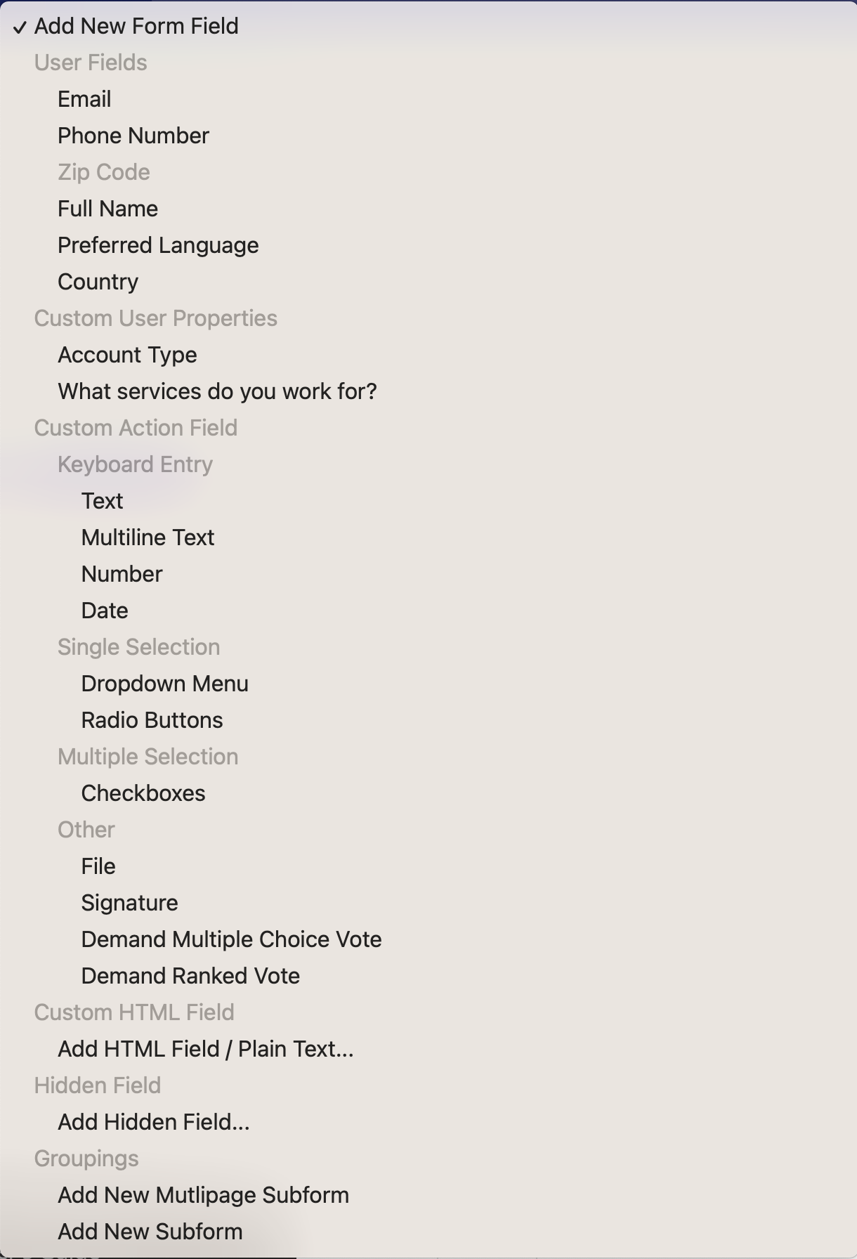
The content of this dropdown will look identical as above, except for the Custom User Properties section will be tailored to your Organization's Custom Properties. Below is a breakdown of each of the field types, with a brief description:
User fields
All user fields & Custom User Properties will have their associated Person record attributes updated once the form is successfully submitted.
Email: A valid email address field. The email address domain name will be checked for valid MX records, and disposable email addresses (eg. mailinator.com) are not allowed.
Phone Number: A valid phone number. You can require that the phone number be of US-origin (you can only text and call US-based numbers). By default, Solidarity Tech validates that a user's phone number is a text-able mobile phone number. This validation can be disabled.
Zip Code: A 5-digit US zip code. You can enable zip code validation to not allow invalid US zip codes. You can also limit zip code input to a state, for example, making any zip code provided outside of California invalid.
Full Address: A complete address component including street address 1, street address 2 (optional), city, state, and zip code. There is an option use address autocompletion, to make it easier for users to fill out their complete address. In addition to ease, the autocomplete option will geocode the address and update the latitude and longitude of your user in the database for mapping and targeting.
Full Name: A first a last name for the Person. You can optionally split the full name into separate fields for first and last name.
Alternate Name: A free-text field for a community name, nickname, or alternate romanization. Stored directly on the Person record (alongside First Name and Last Name) and used to populate the {{ user.preferred-name }} merge tag. Useful for intake forms where members commonly go by a name other than the one on record.
Date of Birth: A date input that saves to the Person's Date of Birth field. From this, the Person's current Age is computed automatically and made available to filters, exports, and the {{ user.age }} merge tag. The value is stored as a date, so it stays accurate as birthdays pass.
Preferred Language: The preferred language for the Person. If a resource (page, email blast, etc.) is available in their preferred language, it will be delivered as such.
Country: Select your country from a dropdown of all countries on earth.
Custom action fields
Text: A single line input field for text. You can choose to pre-pend or post-pend the input field with labels (for example the $ sign for a currency). You can also use regular expressions to validate a field and show a custom error message if the user input doesn't match the expected input.
Multiline Text: A multiple line text input.
Number: A single line text input limited to numbers
Date: A calendar date that can be edited using the built-in browser calendar settings. You can validate the minimum and maximum allowable date using three distinct forms methods: a) "current" references the current date on the day the page is loaded, b) MM/DD/YYYY format (eg. 01/28/2026), c) using Ruby-style relative dates like "2.weeks.ago"
Dropdown menu: A single selection field with any number of defined options. You can specify that this field be searchable, so that user's can easily find a specific option on a long list. By default, the first option is selected, but you can specify that the dropdown begin with a placeholder that you define.
Radio buttons: A single selection input where all the options are visible at once.
Checkboxes: A multiple selection input. You can define the minimum number of checkboxes that a user must include before the field is considered valid. Also, you can truncate a large list of checkboxes after X number of options. If truncated, a "Show More" link will be included at the end of the list to reveal the rest of the options. Enable "Searchable" to display checkboxes as a searchable multi-select dropdown instead.
Adding an "Other" Option with a Write-in Field
If you want respondents to be able to write in their own answer when none of the provided options apply, you can pair a checkboxes (or radio buttons) field with a conditionally visible text input:
- Add an option called "Other" to your checkboxes field.
- Add a new Text input field directly below the checkboxes field.
- Set the text input's label to something like "If other, please specify."
- Set the text input's visibility to Visible conditionally, and configure it to show when the checkboxes field contains the value "Other."
The text input will stay hidden until the respondent selects "Other," at which point it will appear for them to type in their answer. This same pattern works with radio buttons and dropdown menus as well.
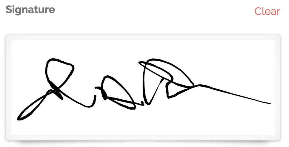
Signature: Collect a digital signature signed by swiping a finger or mouse.
File: A video, image, or audio file uploaded by your user. The following file size limits apply to media: 5MB for images, 75MB for videos and audio.
Image Processing
Enable facial detection and cropping for uploaded images to automatically generate a [field_name]_processed URL for uploaded images that include a face. This processed image can be used in various ways, such as creating custom membership cards with a user’s cropped photo for printing and distribution.
Field Options: "Disabled" and "Defaults On" Toggles
All form fields in Solidarity Tech that allow multiple Options come with two powerful toggles to enhance usability and configuration:
-
Disabled: Prevents a specific option from being selected or displayed in the form. This is useful for phasing out outdated options while maintaining historical data integrity.
-
Defaults On: Automatically pre-selects an option as the default when the form is loaded for respondents. For instance, if you enable "Defaults On" for the "Community Supporter" option, it will be pre-selected for users filling out the form.
Example:
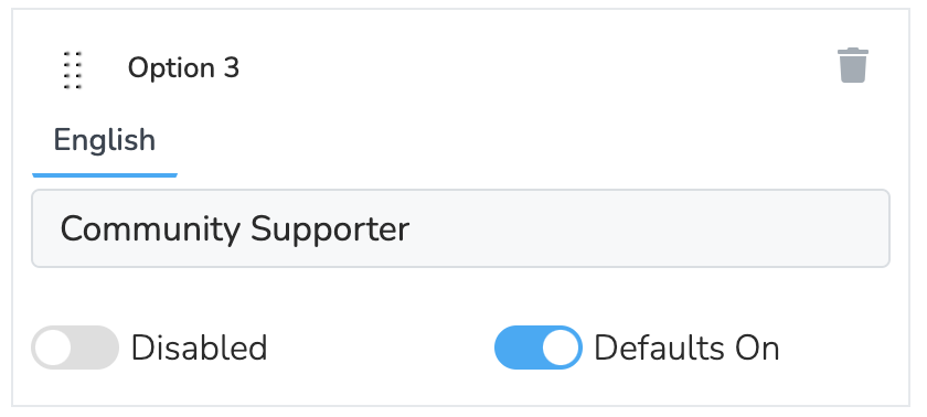
In this example, the "Community Supporter" option has the "Defaults On" toggle activated, ensuring it is selected by default when users interact with the form.
How to Use These Toggles
- Navigate to the form field settings within the Pages editor.
- Locate the "Options" section for any field.
- Toggle Disabled or Defaults On for each option as needed.
Notes:
- Use the Defaults On toggle to guide user responses when a specific choice is expected or preferred.
- Only one option should have Defaults On enabled for any field to avoid conflicts.
By leveraging these toggles, you can streamline form interactions and maintain a polished experience for your respondents.
Demand fields
Demand Multiple Choice Vote: Add demand fields that users can vote on. You can determine the selection of the Demands to be voted on by three methods:
- Specified: Choose one-by-one the Demands you want included in the Form.
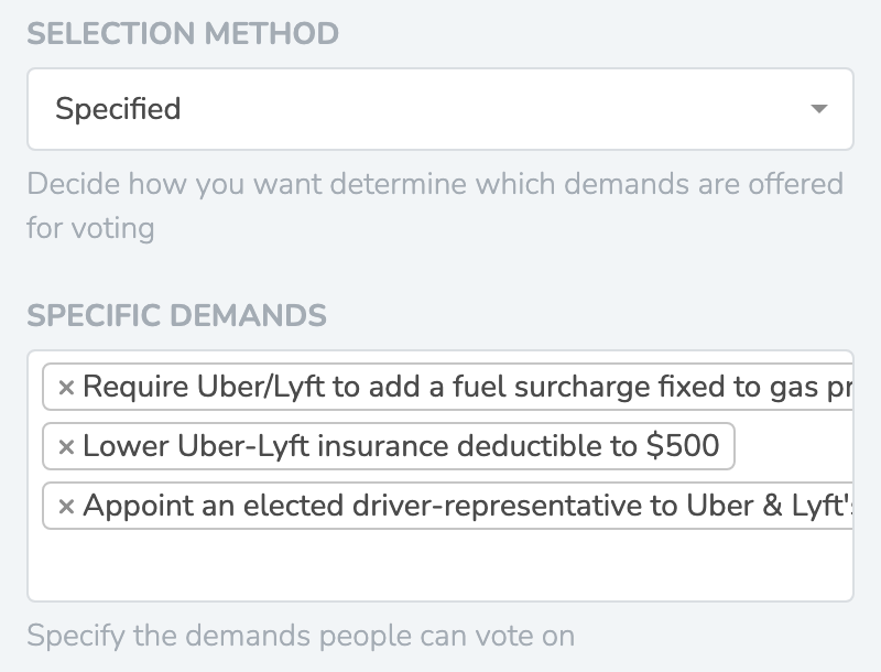
- Unvoted: Automatically take Demands that a logged in Person has not voted on and offer those for voting. You can choose how many Demands you want to limit the field to.
- Random: Take random demands. You can choose how many Demands you want to limit the field to.
Demand Ranked Vote: A field that allows users to vote on their top demands using a ranked choice voting methodology. Oftentimes, People may vote on many Demands with the highest possible level of support, and ranked choice voting allows you to discover the nuance of opinions between these Demands by asking People to sort their Demands by priority. You can select the Demands to be sorted using three method:
- Highest Voted (default)
- Specified
- Random
Custom HTML field
A fully customizable HTML field. Use our HTML editor to built out the content visually, or dig into the raw HTML content to customize your content without limits.
Hidden field
A hidden field is an input field of type hidden with a pre-set value. These fields will be submitted without any user modification.
Groupings
Multipage Subform: Split your form into multiple pages, to break a large form into bite-sized pieces. The form will not be saved and submitted until after the user completes the last page and submits the form
Subform: A subform allows you to group multiple form fields into a single section. This can be useful if a) you want to visually block a set of questions into a section, or b) you want to conditionally show an entire subform based on some logical evaluation.
Pre-filling Forms via URL Parameters
Pre-populate form fields by passing values as URL parameters. Useful for marketing campaigns, QR codes, email links, and partner integrations.
Basic Usage
Add field names and values as query parameters:
https://yoursite.org/join?first_name=Jane&last_name=Smith&zip_code=90210
Supported Fields
Works with all form field types: text inputs, phone numbers, emails, dates, dropdowns, radio buttons, checkboxes, textareas, and custom properties.
Radio Buttons & Checkboxes
Use either the option value or label text (case-sensitive):
By value: ?account-type=5gMb7ob4
By label: ?account-type=Rideshare Driver
Multiple checkboxes (comma-separated): ?interests=Climate,Healthcare,Housing
Note: Label matching is case-sensitive. Value matching takes precedence.
Phone Numbers
Use international format with country code:
?phone_number=14155551234
The number will be automatically formatted with the correct country flag.
Precedence
When multiple sources provide values (lowest to highest priority):
- Autosaved data (browser storage)
- URL parameters
- Event shift parameters (
event_session_ids)
Notes
- Disabled/readonly fields won't be pre-filled
- Invalid values are silently ignored
- URL-encode special characters (
%20for spaces) - Pre-filled values trigger change events for conditional logic
Tracking Form Sources with UTM Parameters
Track where form submissions come from by adding utm_source (and other UTM parameters) to your form URLs.
Example:
https://yoursite.org/join?utm_source=canvass-event-downtownHow It Works
- Add
?utm_source=your-source-nameto any form URL - When someone submits the form, the UTM source is recorded with their submission
- View sources in the page's Results tab or filter by UTM source in People
Use Cases
- Track which events drive the most signups (different QR codes per event)
- Measure email vs. text vs. social media conversion
- Compare performance of different campaigns
Other UTM parameters supported: utm_medium, utm_campaign, utm_term, utm_content
Tip: Create unique QR codes for each event by generating QRs from URLs with differentutm_sourcevalues. You can then see exactly which event brought in each signup.
Liquid template variables
Liquid templating language Merge Tags can be used in input fields for several parts of the Pages section - from the emails sent to legislator's (Email Legislator) to the follow-up page content shown after a form is successfully submitted Post-Submission. In all Page sections where you can use Merge Tags, you can also substitute a Form component's name value to substitute in the value submitted by the user in the form.
For example, if you're using an Email Legislator page, and you have a form component with the name housing-development-name, you can include the value submitted by the user within your email, by including the following Merge Tag in your email: {{ housing-development-name }}.
Common attributes amongst types
Alongside "Show", there are several attributes that all Form Fields will have:
Name: This is the key that's used to uniquely identify a form field. The name must be unique across the entire form.
Label: The text above an input field describing what the user should input.
Placeholder: The grayed out placeholder text shown for input fields before a user begins to input any value.
Hint: The small, gray text below an input field, giving the user tips on how they should fill out the field.
Styling options
Classes: The HTML classes to add to the field's class attribute.
Style: CSS styling added to the field inline
Label style: CSS styling adding to the label inline
Label as real-time liquid template: Sometimes, you want to customize a field label depending on previous answers. To do this, you can enable this option and use the Liquid templating language to reference other fields. For example, let's say you have a form with an employer dropdown field that asks users who their employer is. Then, later in the form, you want to ask the user the date that their specified employer hired them. We can create a Date form field, enable "Label as real-time liquid template", and use the label Date Hired by {{ employer | capitalize | default: 'Employer' }}. This will reference the value of the employer field, capitalize the value, and display that as the label for the Date field. So if the employer selected previously in the form were "Instacart," the Date label would ask "Date Hired by Instacart."
Form Settings
In the Form tab, the bottom section of that tab allows you to customize certain form settings that are outlined below:
Submit button label: This is the customizable label used for your form's submit button
Disclaimer: Small-type text that will appear underneath your form's submit button. This is typically used to explicitly note that a contact is giving your organization permission to text or call them if they submit the form.
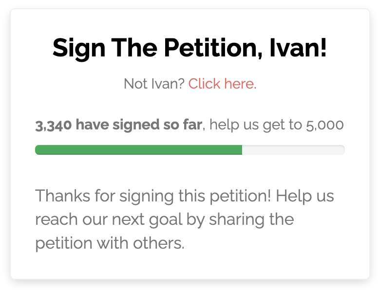
Form title: This option is only available if your form uses a sidebar page template. The form title appears at the top of the sidebar form. For certain pages like petitions, it will have a default value (eg. "Sign the petition!").
Require reCAPTCHA: Enabling this requires that all form submissions include a valid reCAPTCHA response for spam protection. If enabled, the form can ONLY be submitted on Solidarity Tech hosted pages
Autosave form: Enabling this will autosave all user-inputed form data until they have successfully submitted the form.
Disable animations: Enabling this disables all page animations that occur while filling out the form.
Note on Chapter Assignment
When a form has a default scope, that scope applies to new records created through the form. If a person already belongs to a different chapter, submitting the form will not change their primary chapter. The response will still be recorded, but it will not override the person's existing primary chapter assignment.
Updated 8 days ago